User interface
Intended audience: all
This article provides a general overview of the system interface, how information is organized, and how to navigate and enter data using a mouse, keyboard, or touchscreen.
User experience features
Top bar
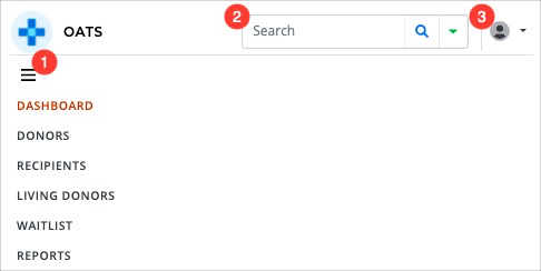
The top bar appears at the top of each page, and includes the following:
-
Navigation to the main areas of the system.
The available options depend on your role.
On a tablet or mobile device, select the three horizontal bars to open and close the menu.
Search to quickly find recipients and donors based on name, TGLN ID or CTR/CTD ID.
-
Account management menu, which provides quick access to:
Support.
Administration and settings.
Log out.
Desktop view

Tablet and mobile view

Sidebar
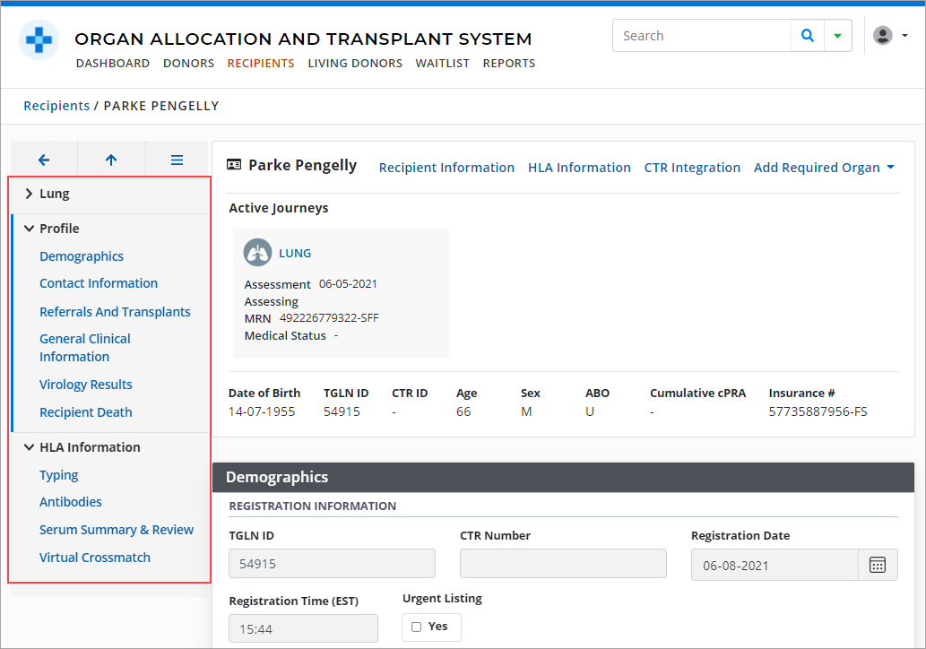
The sidebar appears on the left side of all recipient, donor, and living donor profile pages. It supports navigation to the various sections of a profile.
For more information, see:
Sidebar Icons
Sidebar icons provide additional options for viewing and navigation.
Icon |
Description |
|---|---|
 |
Select the icons to the left of a section’s name to expand or contract the section. |
 |
Select the menu visibility icon to hide or display the sidebar. |
 |
Select the return to previous page arrow to return to the recipient list. |
 |
Select the return to top arrow to return to the top of the section you are currently viewing. |
Lists
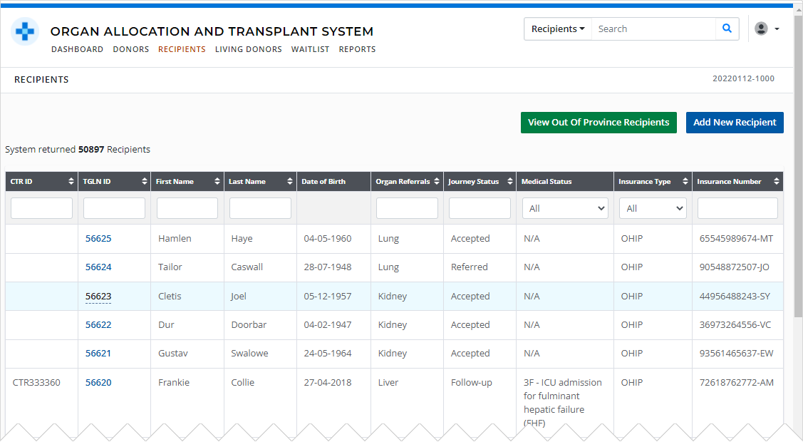
Large amounts of information are presented in searchable, sortable, and filterable lists.
For more information, see:
Historical tables and fields
In many sections of the recipient, donor, and living donor profiles, historical information is presented in tables.
If the table contains many records, you may be able to control how many rows are displayed, and navigate through multiple sets of records.

To see the full details of historical records, select a row in the table. The system presents its details in the fields below the table.
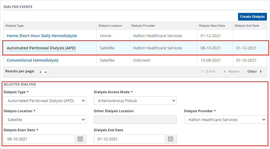
These fields are also used to add new information to the system.
Mandatory fields are marked *.
White fields are available for editing.
Gray fields are locked from editing.
Redacted information
A row of asterisks (*******) may be displayed in place of a donor or recipient’s Personal Health Information (PHI.) This indicates you do not have the appropriate permissions to view this information, for example:
A donor or recipient is not associated with your transplant program.
Navigation and data entry
Mouse and touchscreen
Click or tap to enter a field or open a link.
Scroll or swipe to move up or down on a page.
Prompts and popups
The system uses popup prompts to alert you to important information and ensure you understand and accept the consequences of certain actions. Popups can also appear if additional information is required.
For example:
-
Overriding (deactivating) exclusion filters.

Fields
Mandatory fields are marked *; a value is required to be entered before the form can be saved.
White fields are available for editing.
Gray fields are locked from editing. They may become editable (turn white) based on user actions.
Additional fields/windows
If the system needs additional information because of a selection you make, the system presents an additional fields(s) or information popup windows for you to complete.
For example:
-
Recipient: Gender is different than biological sex. If ticked yes, a new field appears for additional details.

-
becomes

Keyboard
To navigate using a keyboard:
Use the Tab key to move through the page from left to right, top to bottom.
Use Shift+Tab to move back through the page, from bottom to top, right to left.
-
Active (i.e. selected) links, icons, fields and buttons are indicated with:
-
A solid blue border.
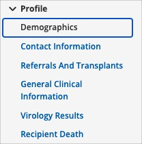
-
A pale blue border.

-
A change in colour.
-
Not selected:

Selected:

-
-
Navigation and data entry reference guide
This table outlines how to work with various on-screen elements using a keyboard, a mouse, or a touchscreen.
On-screen element |
Keyboard |
Mouse |
Touchscreen |
|---|---|---|---|
|
Data entry field 
|
Tab to the field. Type into the field using the keyboard. |
Click the field. Type into the field using the keyboard. |
Tap the field. Type into the field using the on-screen keyboard. |
|
Dropdown list 
|
Tab to the field. Press Spacebar to open the list. Press arrow keys to navigate up and down. Press Spacebar to select an option from the list. |
Click the field to open the list. Click to select an option from the list. |
Tap the field to open the list. Swipe to navigate up and down. Tap to select an option. |
|
Checkbox  
|
Tab to the box. Press Spacebar to add or remove the checkmark. |
Click the box to add or remove the checkmark. |
Tap the box to add or remove the checkmark. |
|
Radio buttons 
|
Tab to the option you want to select. Press Spacebar to select the option. |
Click the option you want to select. |
Tap the option you want to select. |
|
Date field 
|
Tab to the field. Type the date in DD-MM-YYYY format. |
Click on the field. Type the date in DD-MM-YYYY format. |
Tap the field. Type the date in DD-MM-YYYY format or use the date-picker tool |
|
Calendar / date picker  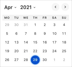
|
Tab to the calendar icon. Press Spacebar or Return / Enter to open the date picker tool. Use the Tab and Spacebar keys to select from the Month and Year dropdown lists, or select the back (<) and forward (>) icons to navigate the calendar by month. Use the arrow and Spacebar keys to select a day. |
Click the calendar icon to open the date picker tool. Click the Month and Year dropdown lists to select a value, or click the back (<) and forward (>) icons to navigate the calendar by month. Click a day to select it. |
Tap the calendar icon to open the date picker tool. Tap the Month and Year dropdown lists to select a value, or tap the back (<) and forward (>) icons to navigate the calendar by month. Tap a day to select it. |
|
Multi-select (Add)  
|
Tab to the field to open the list of options. Repeat the following, until you have selected all desired options:
|
Click the field to open the list of options. Click each option you want to select. |
Tap the field to open the list of options. Tap each option you want to select. |
|
Multi-select (Remove) 
|
Tab to the field. Press the Delete or Backspace key. |
Click the x on the right side of each option you want to remove. |
Tap the x on the right side of each option you want to remove. |
|
Button 
|
Tab to the button. Once the button is selected (indicated by a slight change in colour), press Spacebar or Return / Enter. |
Click the button. |
Tap the button. |
